
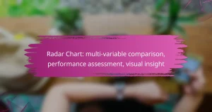


Radar Chart: multi-faceted comparison, performance metrics, visual clarity
Radar charts are a powerful visualization tool that facilitates multi-faceted comparisons by displaying various performance metrics across different dimensions. Their unique design allows users to quickly identify strengths and weaknesses,…
Heat Map: data density representation, quick insights, color differentiation
Heat maps are powerful tools for visualizing data density, enabling users to quickly discern patterns and trends through color differentiation. By employing color gradients, they transform complex datasets into intuitive…
Scatter Plot: relationship insight, data variability, analytical depth
Scatter plots are essential for visualizing the relationship between two variables, enabling analysts to discern how one variable may influence the other. By effectively representing data points in a two-dimensional…
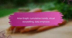
Area Graph: cumulative data, visual impact, trend emphasis
Area graphs are powerful tools for visualizing cumulative data, providing a clear representation of trends and relationships over time. By effectively illustrating how different datasets contribute to a total, they…
Histogram: frequency distribution, data range, interval grouping
A histogram is a graphical representation of frequency distribution, where data is organized into intervals or bins that capture ranges of values. By displaying the height of each bin to…
Box Plot: statistical summary, data spread, outlier identification
A box plot is a powerful tool for visualizing the distribution of a dataset, providing a clear summary of its central tendency, spread, and outliers. By displaying key statistics such…
Bar Graph: simplicity, audience engagement, data clarity
Bar graphs are an effective tool for enhancing audience engagement by presenting data in a straightforward and visually appealing format. Their simplicity allows viewers to quickly understand complex information, making…
Funnel Chart: ignoring drop-off rates, lack of context, misleading conversion rates
Funnel charts are valuable tools for visualizing customer journeys, but they can be misleading if drop-off rates are ignored and context is lacking. Misinterpretation of conversion rates can lead to…
Bubble Chart: multi-dimensional data, size representation, relationship visualization
Bubble charts are a powerful tool for visualizing multi-dimensional data, effectively representing three variables through position, size, and color. By illustrating relationships and magnitudes among data points, they facilitate a…
Bar Graph: categorical comparison, visual clarity, data representation
Bar graphs serve as an effective tool for categorical comparison, offering a clear visual representation that allows for quick assessment of differences and trends among various categories. By focusing on…